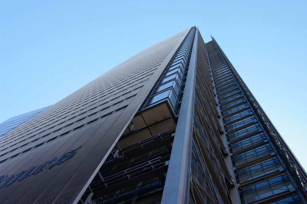
Ceramic rod screen density can give a facade more than one visual character without changing the material. At the New York Times Building, the closely repeated rods read as a field. Open areas let the glazing come forward. Near the top, the screen becomes more open and the edge appears lighter.
The building was designed by Renzo Piano Building Workshop with FXFowle Architects and completed in 2007. The architect’s project account describes horizontal ceramic rods on a steel frame outside transparent glazing. This is an independent built reference. The design reading below concerns its visible composition.


Start with the building-scale pattern
From the street, the eye does not count each rod. It reads broad areas of closely repeated lines and larger breaks in that repetition. The first photograph makes those layers clear. The screen and the glazing remain distinct, even though the two occupy the same elevation.
For a new facade, start with the areas that should read as one field. Then identify the places where a clearer view or a distinct edge matters. A screen can remain orderly even where the density changes, provided those changes belong to a larger arrangement.
Read ceramic rod screen density at two scales
There is a difference between the gap from one rod to the next and an open band across several rods. The small gap sets the texture of the field. The larger break changes the composition. In the street view, both can be seen at once, but they serve different roles.
Close to the building, individual lines and the glass behind them become easier to distinguish. That is the second test for a proposal. A band that looks thin on a tower elevation may occupy a prominent part of the view from an entrance. Conversely, a subtle change in spacing can disappear at street distance.


Let the top of the screen make its own transition
At the roofline, the architect records a wider spacing as the facade extends above the building. Instead of stopping at one dense horizontal edge, the rods thin out against the sky. The upper part is recognizable as the same screen, yet it does not read with the same weight as the occupied floors.
This is a useful distinction when comparing a uniform field with a transition. A constant spacing can make a crisp top. A gradual change can make the top feel less abrupt. A large open band has a different effect again: it makes a distinct break. None is a universal answer. The choice depends on what the upper edge should do in the building’s silhouette.
Review ceramic rod screen density at street scale
Compare the elevation at distance, a view from the pavement and a view from behind the screen. Keep the profile and glazing consistent while comparing alternatives, so the change in density is easy to read. The study of terracotta screen viewing angles explains why an angled view can also affect the apparent gaps.
Visual studies do not establish shading, glare control, structural capacity or comfort. Those outcomes depend on the project’s geometry, orientation, glazing and support design. Keep the visual decision separate from those checks.
Use LOPO’s terracotta baguette and louver range to review profile options. When you send a project brief, show the continuous field, larger openings and any change at the top. That gives the ceramic and facade teams a clear intent to develop together.